
Adapt a tile for tablet and mobile
Desktop is the tile's base configuration. Tablet and mobile inherit every value from it until you deliberately unlock a field — the same chain-link inheritance you already know from Shopware's own detail pages.
You only ever override what actually needs to differ. Everything else keeps following desktop, including later edits.
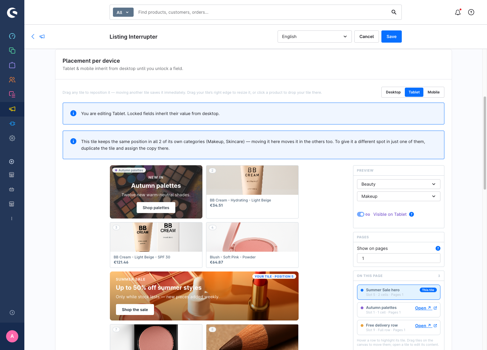
Switch the device you are editing
Both tabs have their own Desktop / Tablet / Mobile switcher:
- Content tab — switcher in the Content card header. It controls the wording, the background image and the colours.
- Placement tab — switcher at the top of the Placement per device card. It controls the position, the width and the visibility.
While a non-desktop device is selected, a banner reminds you: You are editing {device}. Locked fields inherit their value from desktop.
Override content for a device
- Open the Content tab and switch to Tablet or Mobile.
- Click the chain-link icon next to the field you want to change. The field unlocks, seeded with the desktop value.
- Edit it.
To go back to inheriting, click the icon again — the override is removed and the field follows desktop once more.
These fields can be overridden per device:
| Card | Field |
|---|---|
| Content | Background image |
| Content | Badge line |
| Content | Headline |
| Content | Subline |
| Content | CTA label |
| Appearance | Text color |
| Appearance | Background colour |
| Appearance | Overlay |
The link, the alignment settings and the rounded-corner switch are shared across all devices.
Text overrides are per language, exactly like the base headline: switch the admin language in the top bar and author that language's tablet wording separately. A language without its own overrides falls back through the normal language chain.
Image and colour overrides are not translated — one tablet image applies to every language.
Override position and width for a device
- Open the Placement tab and switch to Tablet.
- Drag the tile to a different slot, or drag its right edge to a different width.
That drag writes a tablet override; desktop is untouched. An Inherit chip appears on the tile — click it to clear the position and width overrides and go back to following desktop.
Mobile is a single column, so a tile there is always full-width and has no resize handle. You can still give mobile its own position.
Why a width override is worth setting
A single desktop width already renders responsively: it scales down per breakpoint and is capped at a full row. What plain inheritance cannot express is a tile that gets wider on a smaller screen.
A one-cell tile on a four-column desktop grid is a quarter of the row. Inherited onto a two-column tablet, one cell is half the row. If you want that tile to run full-width on tablet, you have to override the width there.
Hide a tile on a device
The Visible on {device} toggle in the Placement per device card turns the tile off at that breakpoint. It has its own inheritance, independent of position and width.
The tile is hidden, not removed from the layout: the grid still reserves its cells and that breakpoint shows correspondingly fewer products. See Concepts for why.
Check the result
The Live preview on the Content tab follows the device switcher, so it shows the resolved tile — overrides applied, everything else inherited — for the device you are editing. The placement canvas does the same for layout.