
Place reels with the Shoppable Video element
Goal: show one reel, a playlist, or a product's own reels on any page built with Shopping Experiences — homepage, category, landing page or product layout — in the layout mode you choose.
Add the element
- Open Content > Shopping Experiences and edit the layout.
- Add a block. ReelCart ships its own blocks in the Video category: Shoppable Video and Playlist hub. (The element can also be dropped into any block's slot as Shoppable Video.)
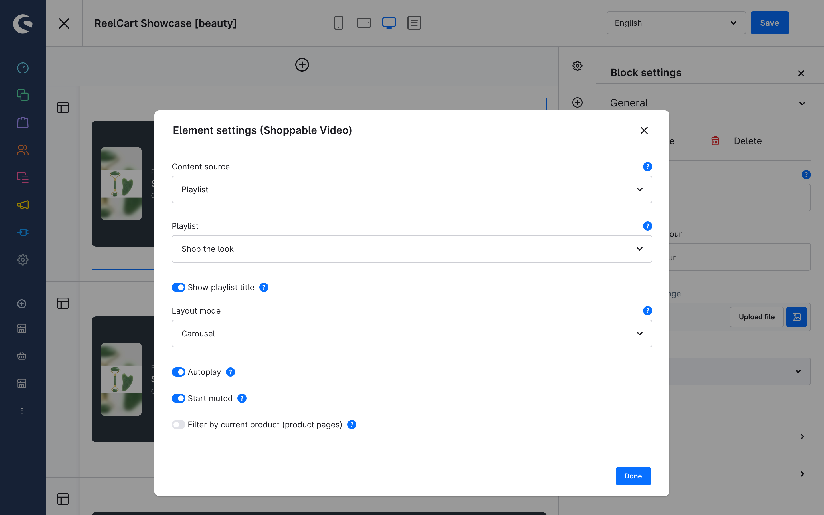
- Hover the element and click its cog to open Element settings (Shoppable Video).
Choose the content source
| Content source | Shows | Works on |
|---|---|---|
| Single reel | One reel you pick. | Any page |
| Playlist | All live reels of a playlist, in playlist order. Picking a playlist pre-fills the layout mode with the playlist's default layout. | Any page |
| Reels placed on this product | The reels that list the product being viewed. | Product layouts only |
| Reels tagging this product | The reels that sell the product being viewed. | Product layouts only |
The two automatic sources render nothing outside a product detail page — including in the layout preview. Use them on a product layout once, and every product page shows its own reels without further setup. They are paged: the first 12 reels render with the page and more load as the shopper scrolls the rail.
Only Active reels ever appear in the storefront, whatever the source.
Choose the layout mode
| Layout mode | What the shopper sees |
|---|---|
| Single player | One phone-shaped player, centred in the content column. |
| Carousel | A horizontal swipe rail. Reels in view play muted and looping; the next card peeks in. |
| Grid | A lookbook wall. Reels in view play muted and looping; off-screen reels stay paused. Tile size (Compact / Standard / Large) controls how wide a tile may grow. |
| Stories bar | Instagram-style circles. Tapping one opens the fullscreen viewer. |
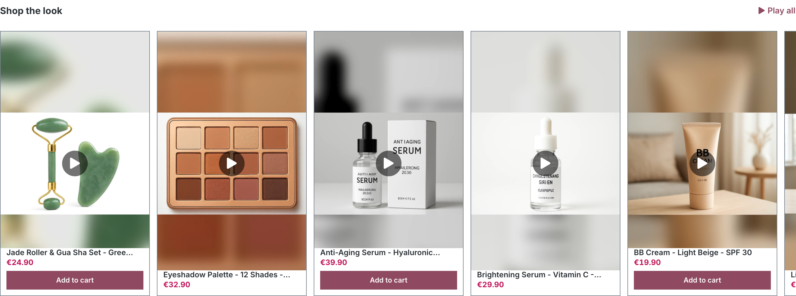
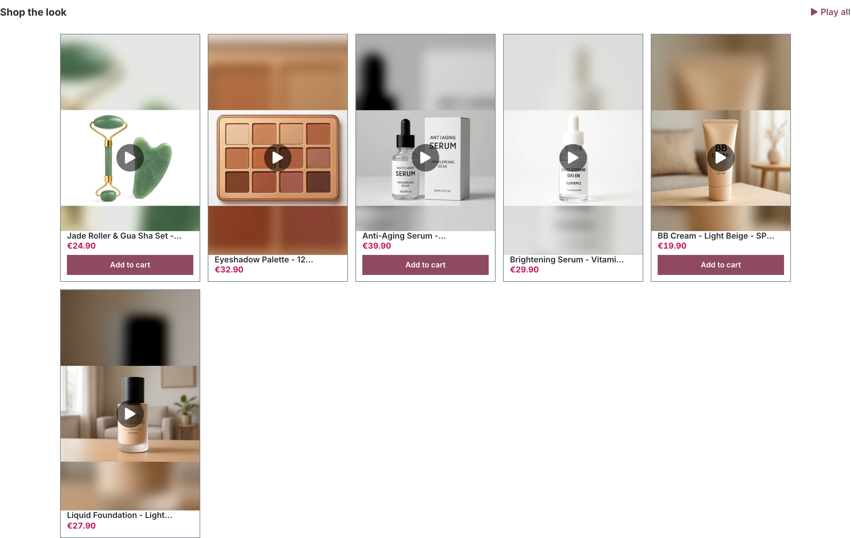

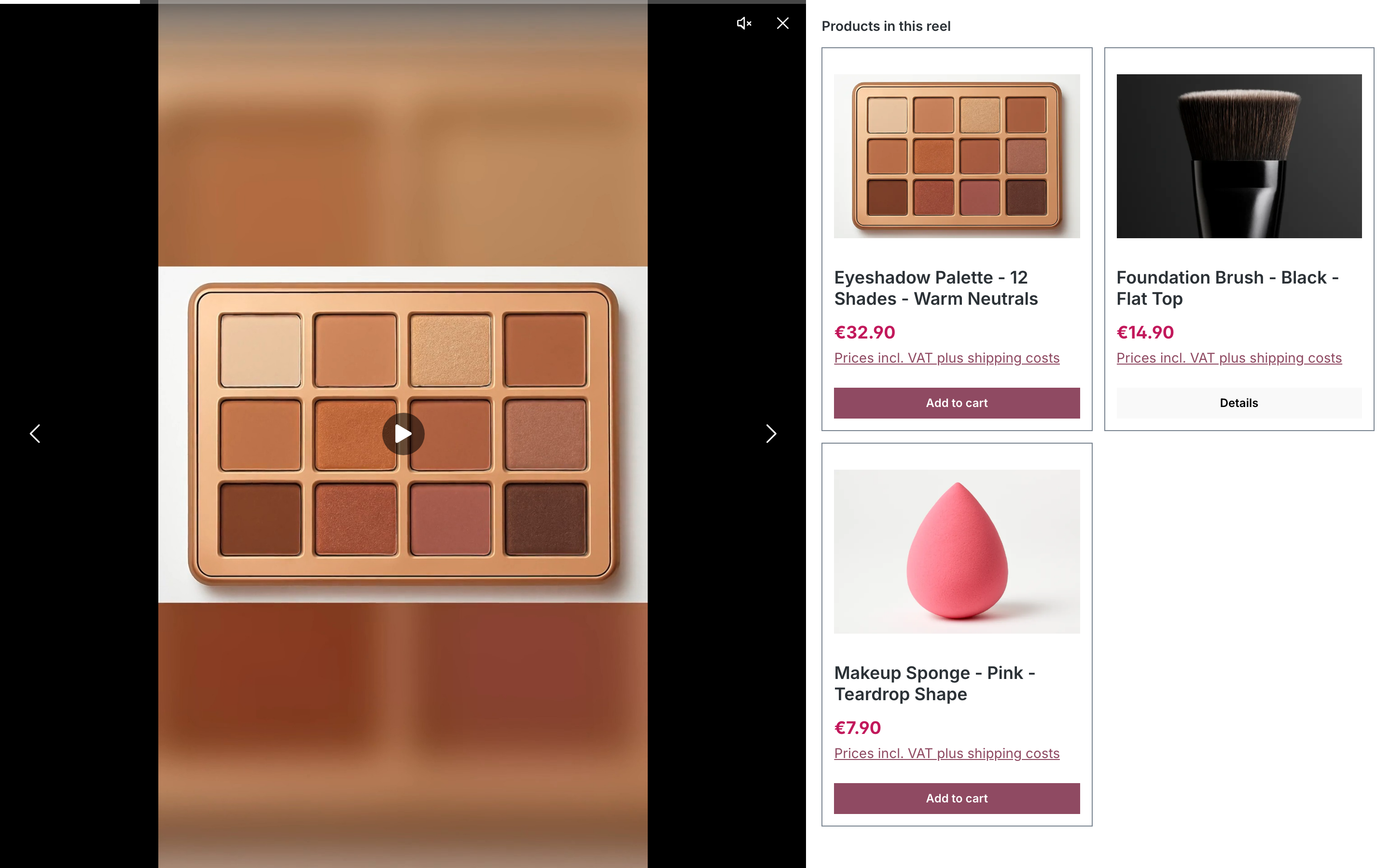
Every tile opens the fullscreen viewer on tap: the video beside a product panel with gallery, price, delivery time, variant selection and add-to-cart. When a reel sells several products, the panel opens on a picker first.
Playback options
- Show playlist title (playlist source) — adds the playlist name, reel count and a Play all button above the videos.
- Autoplay — start once the element scrolls into view. Does not apply to the stories bar, whose viewer always plays.
- Start muted — required for browsers to allow autoplay; shoppers unmute with the sound button.
- Filter by current product (product pages) — on a product page, show only the reels of the source that tag the product being viewed; ignored elsewhere. Useful when a playlist is placed on a product layout.
What happens when a reel ends in the viewer is a shop-wide setting: When a reel finishes in the configuration.
Playlist hub
The Playlist hub element renders several playlists as titled rows, each with its reels and a Play all button — the pattern for a dedicated "Reels" page.
- Playlists: Selected playlists keeps the order you pick; All active playlists shows every live playlist, newest first.
- Start reels muted applies to the rows; the viewer opened via Play all unmutes on interaction as usual.